Top 10 data visualisation tools
Deciphering meaning out of data may take ages when we look at just numbers, but all of this data when converted into a visually appealing format becomes a superpower that accelerates the process of unlocking secrets to consumer satisfaction and eventually business success.
Our brains are fine-tuned to process images much faster than text or numbers and data visualisation is geared towards making the best out of this ability of humans.
Deciphering meaning out of data may take ages when we look only at numbers, but all of this data when converted into a visually appealing format becomes a superpower that accelerates the process of unlocking secrets to consumer satisfaction and eventually business success.
Data visualisation tools convert massive amounts of data in a compelling manner and tell beautiful stories that uncover deep insights that would have otherwise been impossible by looking at data in an uncountable number of cells.
Reading visualisation reports is not rocket science and hence this eases communication between people who have a fair bit of disparity in terms of data literacy.
Let us get down to the details of various business tools that are used for data visualisation.
Table of Contents-
Tableau
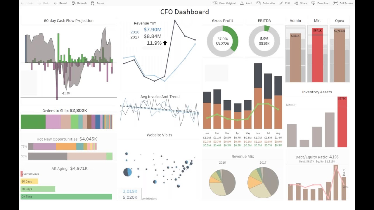
Founded in 2003, Tableau is an American software company that is focussed mainly on interactive data visualisation.
In 2016, it was acquired by Salesforce in an all-stock deal worth more than $15 billion.
Tableau in terms of data visualisation is one of the fastest-growing tools that can be used to convert raw business intelligence data into highly actionable insights. The best part about using this tool is that it requires zero programming knowledge and absolutely no coding skills.
Tableau is one of the fastest-growing business intelligence data visualisation tools mainly because of the following reasons-
Tableau possesses the ability to extract data from a wide variety of sources and platforms such as Excel, PDF, Oracle, AWS, etc.
As soon as Tableau is launched, available data connectors make it easier for systems using Tableau to connect to any database.
Tableau also has its own Tableau Data Engine that can be put into use by data analysts and data engineers alike to pull data and work on it and generate visualisations. These visualisation thus generated are in the form of static files that can be accessed using the Tableau reader
Tableau also has its own enterprise platform named Tableau Server that provides its users the ability to collaborate, manage the distribution of data, as well as the visualisations generated, the governance of data topped up with the strict security models that ensure tight privacy as well automation features that ensure smooth data operations.
If we look closely Tableau provides an ecosystem of solutions that are conducive to end-to-end operations of data analysis and this is a key reason for its immense popularity in the business intelligence segment.
Google Data Studio
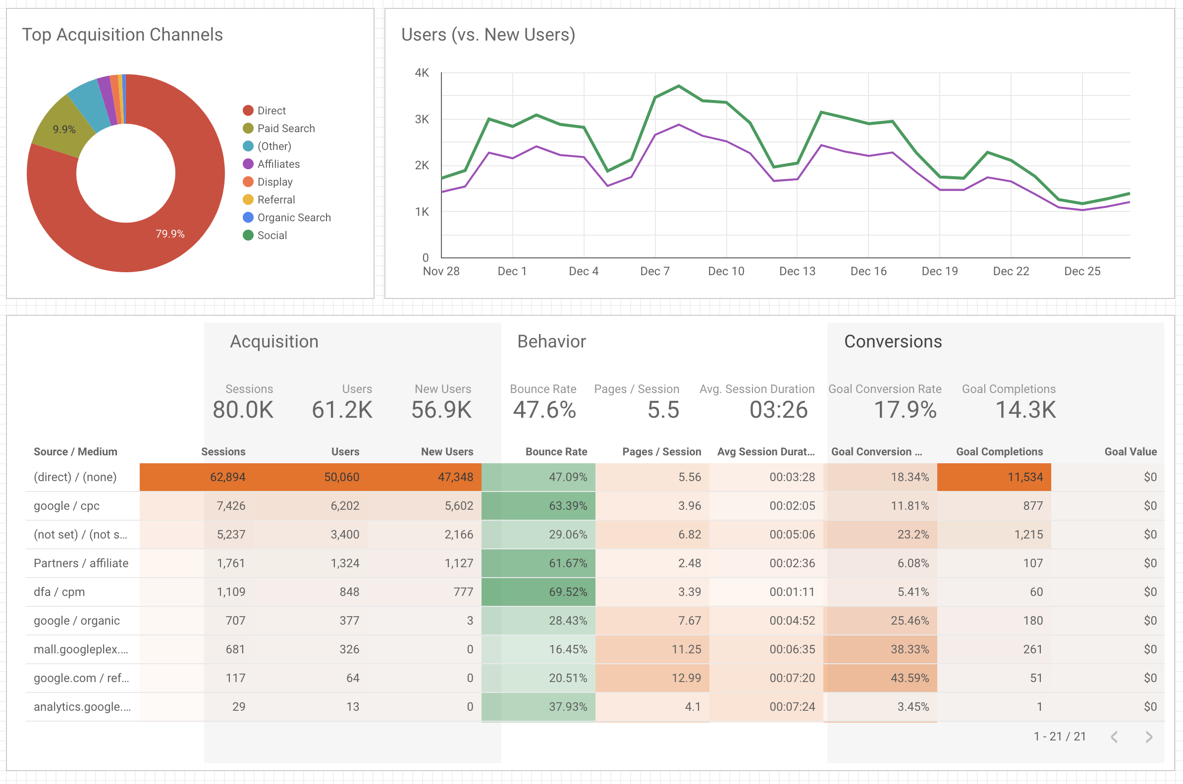
Google Data Studio is a simplified version of Tableau. It is free to use but does not have a lot of features that would allow programmers and coders to use their capabilities.
Just like Tableau, Google Data Studio also accesses data from many platforms and lets its users use them to generate interactive reports, charts, and a lot of different visualisations.
Some of the key reasons that make Google Data Studio a must-have in the arsenal of a data analyst are as follows-
- It provides a visual idea of data points without having to go through analytics software and sheets.
- Charts, reports, and dashboards can be easily created to help others understand what your data means.
Excel
A lot of us perceive MS Excel as a tool that can only contain data within cells and perform operations on them. But those who use Excel frequently for business purposes will always have a different story to tell.
According to market research conducted in 2019, approximately 54% of businesses use Excel and this does not include other spreadsheet applications. Spreadsheet technologies such as Excel and Google Sheets are used by over 2 billion people worldwide. Companies seek candidates with Excel skills because spreadsheets are widely used in daily business analytics.
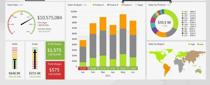
Apart from performing basic to high-end operations on data, Microsoft Excel contains a large number of data visualisation tools such as charts, bars, histograms, polygraphs, Pivot Tables, sparklines, slicers, and more that makes Excel a powerful gateway tool for any beginner in the world of data visualisation.
Charts are used in Excel to create a graphical representation of any set of data. A chart is a visual representation of data that uses symbols such as bars in a Bar Chart or lines in a Line Chart to represent the data. Excel offers a variety of chart types that can be used at the convenience of the user. Also, Excel takes advantage of the forever progressive Artificial Intelligence (AI) and uses the Excel Recommended Charts option to recommend charts tailored to a specific kind of data.
Microsoft Excel is widely used in businesses and is arguably one of the most popular spreadsheet applications. Excel now faces increased competition due to the popularity of other current spreadsheet software. According to the website askwonder.com, Google Suite, which includes Google Sheets, has 2 billion monthly users, whereas Microsoft Excel has an estimated 750 million to 1.2 billion monthly global users.
Sisense
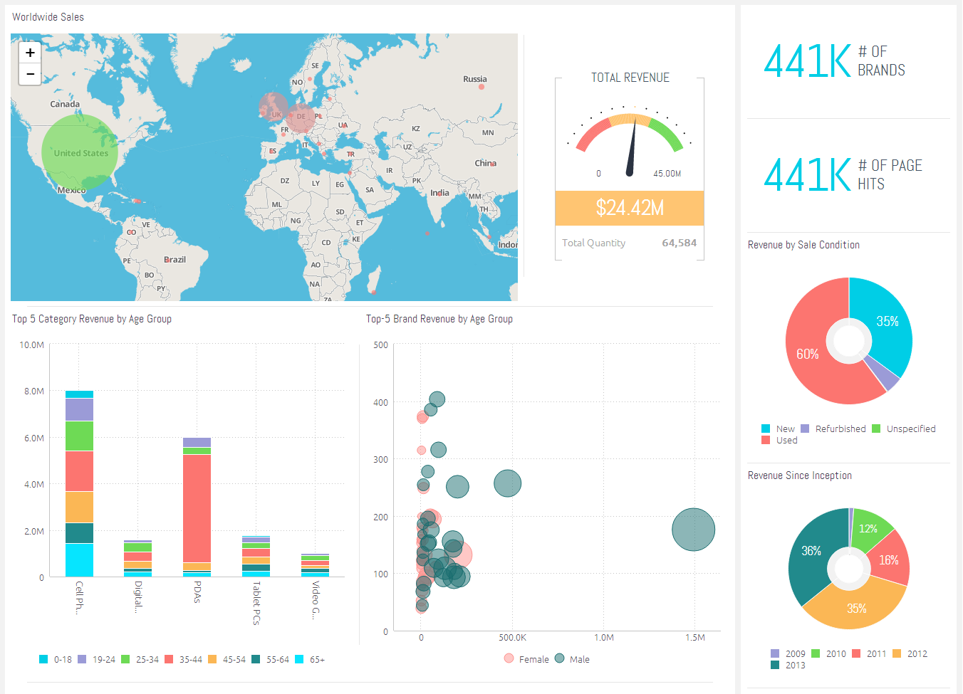
Sisense is a full-stack analytics platform comprised of two components: ElastiCube, its analytical database, and the web interface. Sisense, like Power BI, has drag-and-drop functionality and is highly customizable.
What's great about Sisense is that it provides functionalities such as in-chip processing (which enables faster, more efficient queries) that are more common to mature software on the market, such as Tableau. These inquiries can also be made in natural language, which is supported by apps such as Skype and Slack.
This tool is best for those who are well-versed in data and are looking for advanced features.
DataWrapper
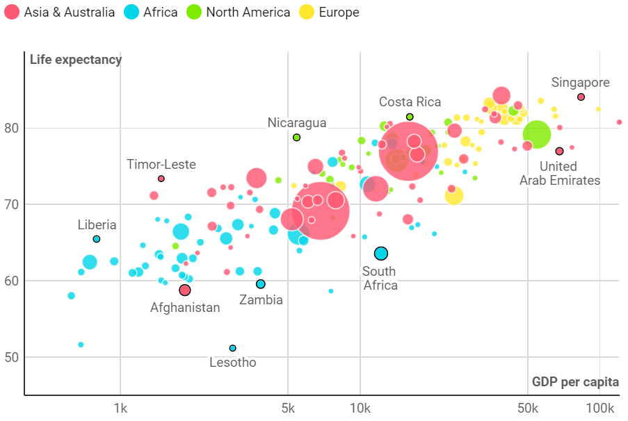
Datawrapper has the appearance of a simple chart tool, but it is capable of delivering interactive and responsive charts, maps, and tables.
It's not so much intended for Business Intelligence purposes as it is for mass-producing next-level data visualisations to draw attention to feeds and pages.
Many businesses, including The New York Times, use Datawrapper on a daily basis to improve their content. The Times conveys complex ideas to consumers about voting data, consumer preferences, and so on by using visualisations made on DataWrapper.
The free version of Datawrapper is ideal for internal or team use, but it is less appealing for public-facing visualisations.
D3.js
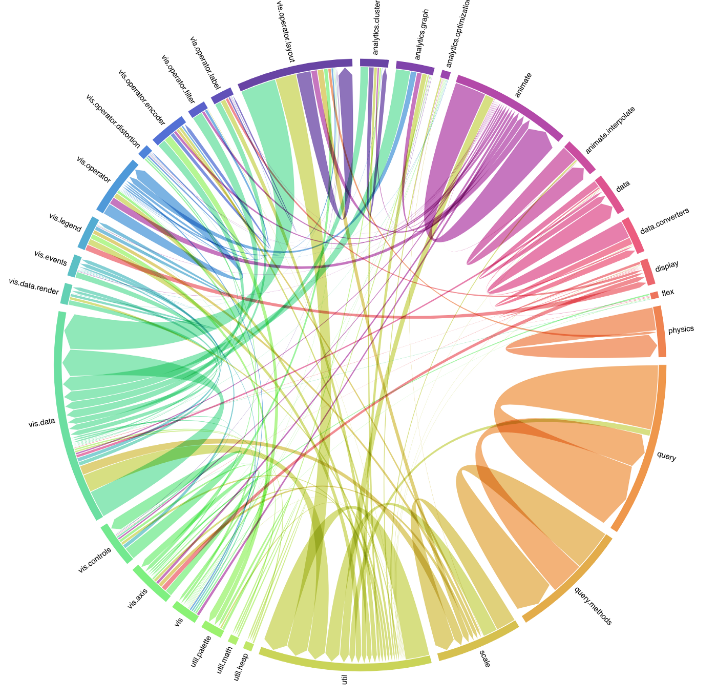
D3, or Data-Driven Documents, is an open-source JavaScript library that is widely used to create custom interactive data visualisations in web browsers using SVG, HTML, and CSS.
There are no standard visualisation formats in D3. We can instead create anything from a simple HTML table to a dynamic line or pie chart, graphs and bar charts, and 3-D geospatial maps using the geojson and topojson formats.
Major benefits provided by D3 include-
- Since D3 is data-focused, it is an excellent and specialised tool for data visualisation.
- Because D3 is a Javascript library, it can be used with any JS framework, such as Angular.js, React.js, and Ember.js.
- D3 is open-source which means we can modify the source code and add our own features.
- D3 works with web standards. A user would not need any other technology or plugin to use D3.
Microsoft Power BI
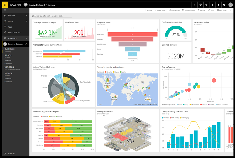
Microsoft Power BI is a data visualisation and business analytics solution. Power BI can be integrated with other Microsoft products in data such as Azure, SQL, and Excel, which come in handy while creating data visualisations. Power BI includes connectors for tools such as Salesforce and Google Analytics.
Power BI is simple to use and appropriate for a non-technical audience.
Advantages of using Power BI-
- Power BI has native integration with Microsoft services and can aggregate data from various resources, including marketing and sales services.
- When compared to other data visualisation tools, Power BI offers a free trial and lower-priced tiers.
The tool is intended for non-technical users.
Qlik Sense
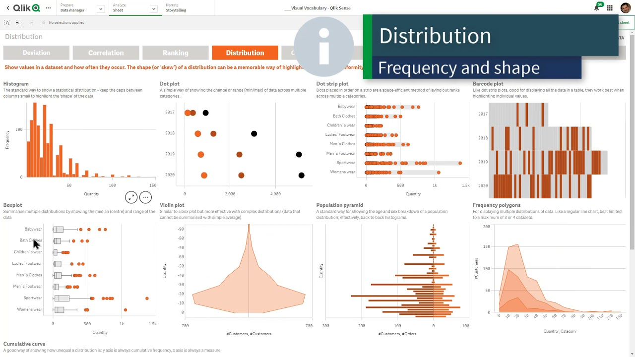
Qlik Sense is a data visualisation platform that assists businesses in becoming data-driven enterprises by offering an associative data analytics engine, sophisticated Artificial Intelligence system, and scalable multi-cloud architecture that allows users to deploy any combination of SaaS, on-premises, or a private cloud.
Qlik Sense makes it easy to combine, load, visualise, and explore data of any size. All of the data charts, tables, and other visualisations are interactive and automatically update based on the current data context. Qlik Sense AI can even provide data insights and assist in creating analytics with just a few clicks.
SAP Analytics Cloud
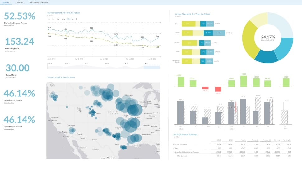
SAP Analytics Cloud employs business intelligence and data analytics capabilities in order to evaluate data and create visualisations to predict business outcomes. It also provides the most up-to-date modelling tools, which alert its users about potential data errors and categorising various data measures and dimensions. SAP Analytics Cloud also suggests Smart Transformations for data, which result in improved visualisations.
If you have any doubts or business questions about data visualisation, SAP Analytics Cloud will answer them using conversational artificial intelligence and natural language technology.
IBM Cognos Analytics
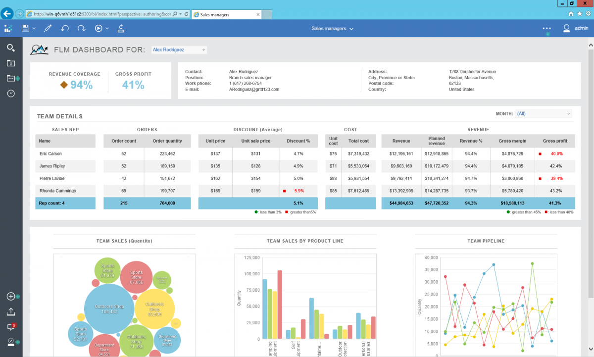
IBM Cognos Analytics is a business intelligence platform powered by artificial intelligence that, among other things, supports data analytics. Users can visualise and analyse data, as well as share actionable insights with anyone inside the organisation. Even if users have little or no experience with data analytics, they can use IBM Cognos Analytics because it interprets the data for them and provides actionable insights in plain language.
With IBM Cognos Analytics users can also share data on the cloud with multiple users and share visuals via email or Slack. They can also import data from spreadsheets, the cloud, CSV files, or on-premises databases and combine related data sources into a single data module.
In this blog, we discussed how data visualisation is essential for moving forward with the analysis. Several popular visualisation tools can assist you in driving your data science process. Each of the tools mentioned has advantages and disadvantages. The choice depends on data maturity, budget, the type of use cases to be solved, company size, and so on.
The best data visualisation tool for you will be entirely determined by your business requirements. A standalone data visualisation solution may be the best option if you simply want to look at your data in new ways.
A cloud-based solution with advanced features, on the other hand, would be more appropriate if you want to connect data from multiple sources or monitor metrics in real-time.

