Understanding Data Visualisation
There has been a gradual shift in the way people consume information. Today, pieces of information that hold a certain amount of value and are visually appealing at the same time attract the maximum number of eyeballs and get higher weightage.

Have you ever thought as to why is it easier for us to remember long tales of mythological creatures and gods, and how all these tales transcend culturally across various timelines and geographies leaving their impressions on future generations?
The answer to this question lies in the art of storytelling. Every time we come across something that is visually captivating and attention-grabbing, it tends to stay in our memory for a longer period of time.
On the other side when it comes to listening, research shows that 60% of the information received tends to get forgotten right after the moment someone stops speaking.
Similar patterns are observed when we look into the field of data analytics.
Let’s understand the same through data. As per a study conducted by Microsoft, the average attention span of a human being went down from 13 seconds in 2000 to 8 seconds in 2013 (1 second below the average attention span of a goldfish).
With the arrival of TikTok, Instagram Reels, and YouTube Shorts people are currently bombarded with information every second and this has certainly changed the way people perceive information.
There has been a gradual shift in the way people consume information. Today, pieces of information that hold a certain amount of value and are visually appealing at the same time attract the maximum number of eyeballs and get higher weightage. This is what brings the concept of Data Visualisation into the picture.
What is Data Visualisation?
Data visualisation is the process of presenting data in a way that is visually appealing to the people it is being presented to. Visualisation employs charts, graphs, maps, and other pictorial tools to convey information from a large chunk of data in an efficient, compact, and comprehensive manner. It provides structure to data in a way that is easy to understand.
It is essential to establish the fact at the beginning that data visualisation is a skill that simplifies a lot of information and it is not just limited to data teams.
It is a skill that almost everyone in an organisation is well-versed with. Their use cases might be varied.
For example, people in the upper echelon of an organisation use it to convey important messages regarding hierarchy, business goals, performance reports, etc. On the other hand data analysts and scientists might use the same skill to convey trends and patterns pertaining to a particular set of data gathered.
Visualisation is an extraordinary and powerful skill. It is all about using our eyes more to visualise information so we can see trends and patterns in data and connect with it.
Importance of data visualisation
In an age where data acts as the oil that businesses run upon, a massive amount of data gets collected, and all of this data that is fathered further acts as the fulcrum about which the wheels of businesses turn. Following are a few ways data visualisation serves businesses all over the world.
Decision Making: When we use the word “data”, we take into account all the data that is stored in gigantic data centers in some corner of the world. One very simple way data analysts and data scientists access all of this data is through spreadsheets.
For someone like data analysts and data scientists who are immersed in data throughout their careers, accessing data on a spreadsheet or any sophisticated tool and deriving meaning from it comes naturally.
But when we talk about people with higher authority or more specifically people who have the power to affect business decisions, the idea of deriving insights from data points enclosed within cells and using the same to make business decisions might seem like a far-fetched idea.
Thankfully data visualisation saves the day by bridging the gap with the help of visually compelling stories conveyed through pictorial representations that are more focussed towards an easier understanding of the viewer.
Data packs within itself a lot of valuable insights. What data visualisation does is infuse life into this otherwise mundane data and serves as the key to the door that unlocks crucial decisions that would further help move the business forward, in a faster and easier manner.
In-depth analysis of business strategy: Data visualisation sets into context a lot of information that allows analysts to get a better understanding of the bigger picture that they might actually be missing out on by merely looking at the numbers themselves.
Let us take the example of Facebook page analytics. Each and every business page on Facebook provides its administrators with a lot of data related to the audience that frequently visits their business page or has been following them for quite some time.
For any specific time period, Facebook provides distribution of audience based on various parameters like location, age, gender, interests, the places they visit, and even an overview of the various competitors’ pages they might be following or bouncing off to land on their business page. This information is available in the form of charts, graphs, maps, polygraphs, etc.
All these insights presented in visual format are very crucial for any business that has a page on Facebook to create a buyer persona, make changes to their marketing strategy, gear their communication towards a specific set of buyers, and many other things that would have otherwise been impossible to iron out by just looking at numbers.
Setting up a baseline that helps identify trends: With the help of data visualisation it becomes easier to set up a baseline behaviour. This behaviour becomes the ideal reference against which the data gathered in the future can be tracked. Any changes observed in this behaviour can then be further studied to work out any changes in strategy or find out areas of concern and move forward to deriving solutions for the same.
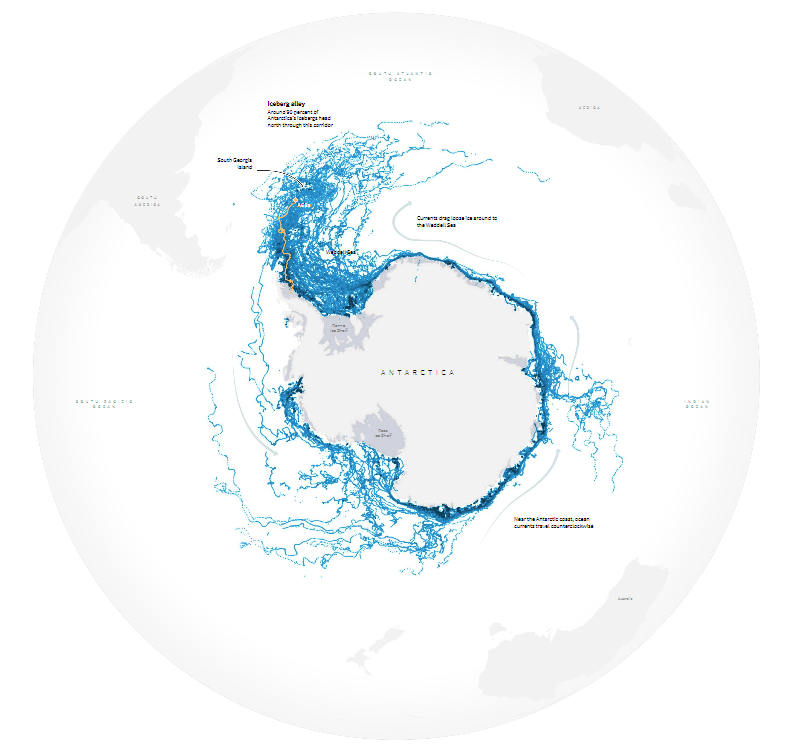
This infographic, warns people about climate change. A massive chunk of ice the length of Puerto Rico broke off the Antarctic peninsula coast and wandered close to the wildlife-rich South Georgia Island.
The graphic compares the size of the berg to that of 66 countries or territories, stating that the ice mass is so large that it cannot be captured in a single photograph. Furthermore, we can see impressive geodata on the wildlife inhabiting the endangered South Georgia Island from the IUCN Red List of Threatened Species.
Visualisation in big data
With every passing day, the amount of data being gathered by businesses is increasing. Businesses are realising the use of machine learning to gather large amounts of data, sort through them and them convert into powerful insights for running businesses. With the help of visualisation, big data goes a step ahead and simplifies the process of making sense of a large amount of data that is gathered.
The methods of visualisation used in terms of big data are very different from the ones used for typical visualisation.
While typical visualisation uses bar charts, graphs, and pie charts for visualisation big data visualisation uses complex tools such as heat maps and fever charts. Big data visualisation brings into use tools more powerful computer systems to gather data and convert the same into representations that are understandable to human beings.
Examples of data visualisation
Earlier the use of Excel was widespread and as such, it was the most common technique used to convert a large amount of data into a form that was understandable to the user.
But with time and the increasing significance of data for businesses the methods of visualisation have also evolved. Following are examples of a few of these techniques that are widely used in today’s day and age.
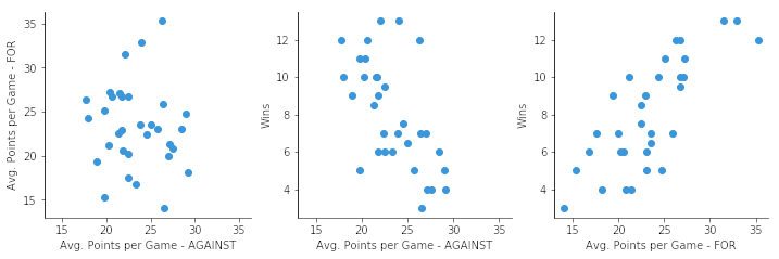
Scatter Plots
A scatter plot is a type of data visualisation that shows the values of two variables as points. The data for each point is represented on the visualisation by its horizontal (x) and vertical (y) position.
Labels, markers, colour, transparency, size (bubbles), and creating 'small multiples' of scatter plots can all be used to include additional variables.
Below is an example of a scatter plot that clearly shows the relation of ground living areas with the sale price of the apartments.

Bubble clouds
A bubble chart is a type of data visualisation in which multiple circles (bubbles) are displayed in a two-dimensional plot. It is a generalisation of the scatter plot, with bubbles replacing the dots. A bubble chart typically displays the values of three numeric variables, with each observation's data represented by a circle ("bubble"), and the horizontal and vertical positions of the bubble display the values of two other variables.
Given below are some good bubble chart applications in sports.
Bullet Graphs
The main data value in a Bullet Graph is encoded by a length with the bar in the center of the chart, which is known as the Feature Measure. The Comparative Measure is a line marker that runs perpendicular to the orientation of the graph and is used as a target marker to compare against the Feature Measure value. So, if the main bar has passed the position of Comparative Measure, you've achieved your goal.
The Feature Measure's segmented colored bars are used to display qualitative range scores. Each colour shade (in the example above, three shades of grey) is used to assign a performance range rating. As an example, consider the terms poor, average, and great. When using Bullet Graphs, the maximum number of performance ranges should be kept to five.
The bullet graph shown below is a good example showing a comparative study of water usage.

Heat Maps
Heat Maps are most commonly used to display a more generalised view of numeric values as a graphical representation of data in which the individual values in a matrix are represented as colours. It is commonly used to represent regions of similar value using colour splotches as an isopleth. Heatmaps use colour in the same way that a bar graph uses height and width: as a tool for data visualisation.
The below heat map shows the music taste of the USA

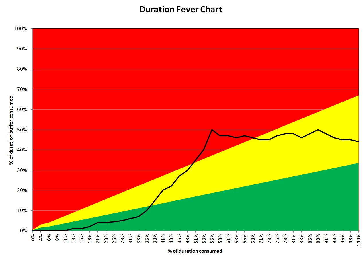
Fever Charts
Fever charts are a graphical representation of data that has changed over time. A fever chart, for example, can represent the change in population in a specific region over time, among other things. The fever chart can be used in a variety of situations. For example, a marketing professional may attempt to analyse the company's sales performance over the last 12 months and compare it to the previous year's sales performance. It is an excellent tool for detecting patterns, anomalies, and behaviours in data, among other things.
Challenges to data visualisation
Big Data visualisation can be a very powerful business capability, but before an organisation can use it, some critical issues must be addressed.
Following are some of the challenges to data visualisation-
Access to visualisation specialists: Many Big Data visualisation tools are designed to be simple enough for anyone in an organisation to use, often recommending appropriate Big Data visualisation examples for the data sets under analysis. To get the most out of some tools, however, it may be necessary to hire a big data visualisation specialist who can choose the best data sets and visualisation styles to ensure the data is fully utilised.
Visualisation hardware resources: In the end, Big Data visualisation is essentially a computing task, and the ability to carry out this task quickly - to enable organisations to make timely decisions using real-time data may necessitate powerful computer hardware, fast storage systems, or even a move to the cloud. As a result, Big Data visualisation initiatives are both IT and management projects.
Data quality: The insights gained from Big Data visualisation are only as accurate as the data being visualised: if it is inaccurate or out of date, the value of any insights gained is called into question. That means putting people and processes in place to manage corporate data, metadata, data sources, and any transformations or data cleaning performed prior to storage.
Every day, data visualisation plays an important role in the business world. According to one study, poor data in the business industry costs the world up to $14.2 million per year. It is time to harness the power of data visualisation in business operations to reduce potential losses that could lead to a company's demise.