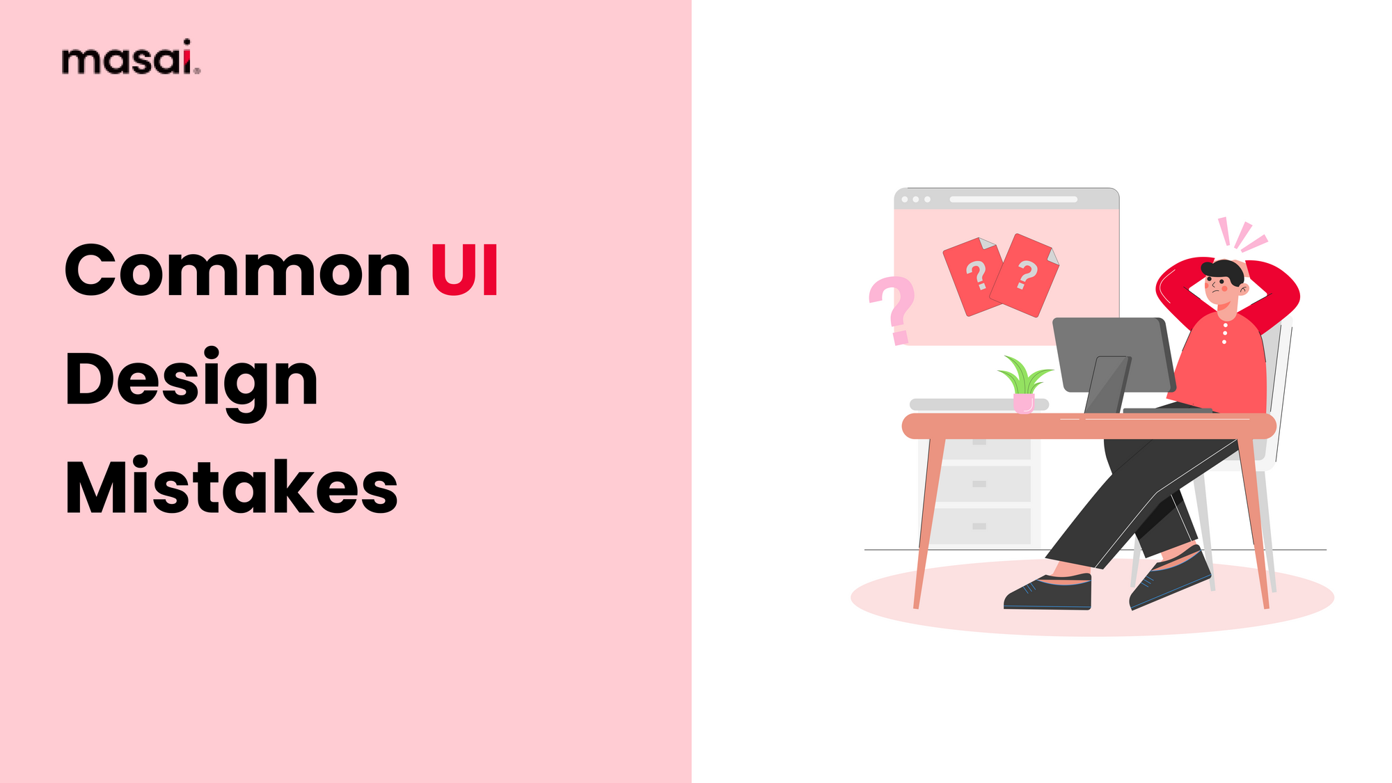
Common UI Design Mistakes to Avoid: Tips for a Smooth User Experience
Discover the key UI design pitfalls and how to steer clear of them. Elevate your user interface to the next level with expert insights and best practices
Introduction
User interface (UI) design has a huge impact on the overall user experience in today's digital landscape. A well-designed user interface can increase user pleasure and engagement, whereas a badly executed one can cause frustration and disengagement. This thorough guide will provide useful insights into avoiding 10 mistakes beginner UI designers make and incorporating effective design concepts to provide a seamless and user-friendly experience, whether you're a rookie discovering the world of UI design or trying to develop your existing skills.
Understanding UI Design Mistakes
Because UI design serves as a link between people and digital products, it is an essential component of user experience. The visual and interactive aspects of a user interface can considerably impact how people perceive and interact with a product. Avoiding common UI design flaws that can impede user engagement and happiness is critical. Poorly performed UI design can lead to user misunderstanding, dissatisfaction, and, eventually, product abandonment. As a result, understanding the consequences of these errors is critical for creating good user interface designs.
Tips to Avoid Common UI Design Mistakes
Here are some tips to help you avoid making common errors in UI design.
- Prioritize Clarity and Simplicity: In pursuing innovation, it is easy to overburden a design with needless components. To avoid this, focus on building a clear and straightforward interface that smoothly directs people through the material. Users can become overwhelmed with cluttered layouts, making it difficult for them to navigate and obtain the information they require.
- Maintain Consistency: It is critical to maintain consistency in design aspects such as colors, typefaces, and button styles when creating a coherent and identifiable UI. Inconsistent design choices can perplex people and disturb their experience. To create a cohesive visual environment, ensure that design components are consistent throughout the interface.
- Improve Navigation: The foundation of a user-friendly design is intuitive navigation. A convoluted or complex navigation layout can lead to user irritation and task abandonment. Keep navigation menus simple, well-organized, and easily available to assist users in navigating the UI.
- Responsiveness is Key: With users accessing digital products on various devices and screen sizes, responsive design is imperative. Failing to optimize your UI for different platforms can lead to a subpar experience for users on certain devices. Test your design thoroughly across devices and ensure that interactions and layouts remain seamless.
- Use Graphics and Images with Caution: Graphics and images improve the aesthetic attractiveness of a UI, but they should not overshadow the content. To avoid sluggish performance, optimize images for faster loading times. Furthermore, ensure that aesthetics enhance rather than distract from the overall user experience.
- Consider Accessibility: Accessibility is an essential part of UI design. Use appropriate color contrast and include alternative text for images to ensure that your design supports users with disabilities. An inclusive design ensures that all consumers can effectively interact with your product.
- Pay Attention to White Space: White space, also known as negative space, is the space between design elements. It helps with visual clarity, readability, and aesthetics. It contributes to visual clarity, readability, and aesthetics. Avoid overcrowding the interface, and allow enough white space to create a balanced and inviting design.
Incorporating Effective Design Principles
To create truly outstanding user interface designs, it is critical to go further into the area of effective design concepts through a software developer course. These principles act as guiding lights, influencing how users engage with and perceive your product. Let's dig deeper into these principles:
- The Visual Hierarchy: Building on the visual hierarchy principle, it's critical to grasp that not all design elements are created equal. You can guide users through a well-defined path by selectively emphasizing specific elements, such as headlines or call-to-action buttons. This not only improves comprehension but also stimulates desirable actions, enhancing the entire user experience.
- F-pattern and Z-pattern Reading: Recognizing people's reading habits allows you to display content in a way that corresponds to their natural behavior. The F-pattern demands that consumers read text-rich information horizontally across the top and then scan vertically. The Z-pattern, on the other hand, is great for material with fewer text elements since it mimics the path consumers' eyes take when reading a page. Adhering to these patterns guarantees effective communication and participation.
- Hicks' Law: With so many options in the digital realm, it is critical to simplify decision-making. Hick's Law emphasizes the need to limit options, allowing consumers to make decisions quickly and confidently. By simplifying options, whether in navigation menus or interaction elements, you reduce the cognitive burden and offer a more pleasant user experience.
- Gestalt Principles: Gestalt principles, which have their roots in psychology, provide insights into how people perceive and interpret visual information. Similarity groups comparable elements together, whereas proximity shows that elements close to each other are viewed as linked. Users are encouraged to mentally complete incomplete shapes by using a closure. Using these concepts, you can create designs that users intuitively understand, creating familiarity and engagement.
Utilizing User Feedback
User feedback is a priceless asset in UI design. It reveals how consumers view your design and assist you in identifying areas for improvement. By incorporating user feedback into your design process, you may improve your user interface to match your consumers' needs and expectations.
Conclusion
To master UI design, a combination of creativity, empathy, and adherence to design principles is required. You may create digital experiences that capture users and offer them a seamless trip by avoiding common design blunders and incorporating practical principles. Remember that UI design is constantly learning; be open to criticism, adapt to changing trends, and consistently emphasize the user's needs. You may build UI designs that are visually beautiful and improve the overall user experience, resulting in goods that customers will enjoy and engage with enthusiastically.
FAQs
What are many prevalent errors in UI design that should be avoided?
There are several common errors in user interface (UI) design that should be avoided. These include the presence of crowded layouts, inconsistent design elements, difficult navigation systems, inadequate responsiveness across different devices, and the excessive use of images that overwhelm the underlying content.
To what extent does consistency maintenance play a significant role in user interface (UI) design?
Ensuring consistency in user interface (UI) design, encompassing elements such as colors, typefaces, and button styles, is of paramount importance in establishing a cohesive and recognizable user experience. The presence of inconsistent design decisions has the potential to perplex people and disturb their overall experience.
The significance of accessibility in user interface (UI) design is a topic of inquiry.
The consideration of accessibility holds significant importance in the realm of user interface (UI) design, as it guarantees that those with disabilities can engage with your product efficiently and effectively. This entails the utilization of suitable color contrast, the provision of alternate text for images, and the incorporation of inclusive design principles.
What is the significance of white space in the context of user interface (UI) design?
The utilization of white space, often known as negative space, is a fundamental aspect of user interface (UI) design that plays a crucial role in enhancing visual clarity, readability, and aesthetic appeal. The use of balance in the design serves to minimize overcrowding and enhances the overall appeal and usability of the interface.
In what ways does the integration of user feedback enhance the quality of user interface design?
The integration of user input holds significant value in the field of user interface (UI) design, as it offers useful insights into users' perceptions of a design and aids in the identification of areas that require enhancement. By incorporating user feedback, it is possible to customize the user interface (UI) to more effectively address the requirements and expectations of users.